Migrating from v4
Comparing to viewer v4
You can switch between the two viewers here by clicking on the tabs below.
- New
- Viewer v4
Upgrading from viewer v4
The new viewer can in most cases be implemented on your website purely declaratively, without any need to write any javascript. This differs from the previous version, which required you to write javascript to initialize the viewer.
To migrate your website to the new viewer, you can follow these steps:
- Add the new viewer to your website - Add the new viewer to your website by adding the following script tag to your website:
<link rel="preconnect" href="https://content.cylindo.com" crossorigin />
<script
  src="https://viewer-cdn.cylindo.com/v1/index.mjs"
  type="module"
  async
></script>
- Replace the old viewer with the new viewer - Replace the old viewer with the new viewer by replacing the following code:
<div id="cylindoViewerWrapper"></div>
<script>
  var viewerInstance = null;
  var options = {
    accountID: 5098,
    productCode: "ARMCHAIR-PDP",
    containerID: "cylindoViewerWrapper",
  };
  if (window.cylindo && window.cylindo.on) {
    window.cylindo.on("ready", function () {
      viewerInstance = cylindo.viewer.create(options);
    });
  }
</script>
with the following code:
<cylindo-viewer>
<img
slot="placeholder"
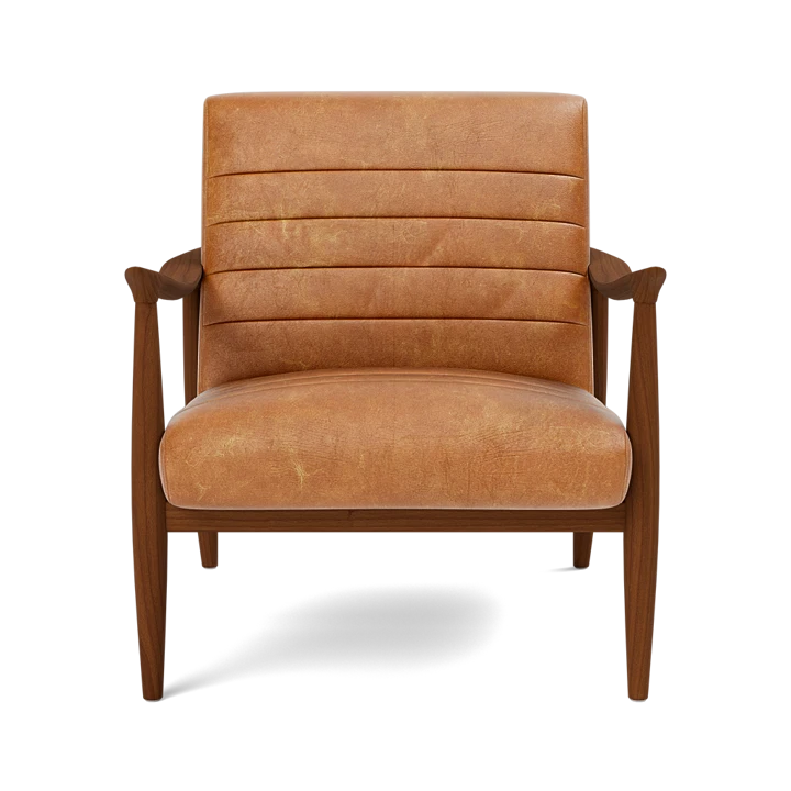
src="https://content.cylindo.com/api/v2/5098/products/ARMCHAIR-PDP/frames/1/ARMCHAIR_PDP.webp"
/>
</cylindo-viewer>
Then add the following CSS to your website:
cylindo-viewer {
  display: block;
  aspect-ratio: 4 / 3;
}

cylindo-viewer img[slot="placeholder"] {
  object-fit: contain;
  width: 100%;
  height: 100%;
}
info
If you wish to support browsers that don't support the aspect-ratio css properties, add this css variable to cylindo-viewer:
--legacy-browser-aspect-ratio: 4 / 3;
Comparison to viewer v4
This new version has been rewritten from scratch with many modern optimizations in mind. This is a non-comprehensive list of major changes:
- Ease of integration - Fully encapsulated web-component that works with any web-framework.
- Web performance - Faster load times with fewer bytes transfered and asynchronous loading.
- Modern image formats - Less image data sent by utilizing modern formats such as
WebP. - Retina support - Automatic support for high-resolution devices and downscale for smaller devices.
- Modular architecture - Only used features are loaded, allowing for faster load times and less bandwidth usage.
- 3D models - View 3D models of products with the new 3D model viewer.
- Studio - Design and publish studios and view them immediately on your website.
- Material swatches - Showcase material swatches and colors for products.
- Touch gestures - Swipe, pinch-to-zoom and rotate products on touch devices.
- Smoother transitions - Smooth, natural animations powered by spring physics.
- Dynamic zoom - Seamless zoom at up to 4k.
- Internationalization - Multi-language support with translatable fields through API.
- Updated documentation - Guides, best practices, and examples.
- Curator - Update viewer appearance without changing code.